Responsive HTML Mobile Website Design
In early 2014, the Internet landscape changed forever; for the first time Internet usage on mobile devices exceeded PC usage
Most businesses are now racing to cope with the migration of audiences to mobile and other devices. All mission-critical web assets need to be smartphone friendly. Websites that force visitors to pinch, squeeze, pull and drag on mobiles are loosing out; customers simply move on to mobile friendly competitors.
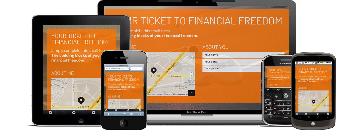
It is quite challenging to have a website change according to the device of the user. An auto-resizing website design is called “responsive web design”. Centaurweb’s expert mobile website designers and developers create responsive HTML5 / CSS3 websites. We can custom re-code your HTML sites or use the famous Bootstrap technology to make your websites compatible with all iPhones, Windows smartphones, Androids, Blackberry, iPads and other tablet devices in addition to the usual PCs and laptops. Large screen Smart TV or Google TV compatibility can be added, if required.
We build responsive pure HTML Mobile website designs as well as those backed by a Content Management System like WordPress (CMS) or Magento / Opencart (e-Commerce). This page provides information about pure HTML mobile website design whereas the responsive mobile CMS web design and responsive mobile e-commerce website design services are described on separate pages.
Our Responsive HTML Mobile Web Design Services:
- Creation of a beautiful home page and inside page UI concept. Simplified layouts and text to provide a pleasant mobile experience
- Initial Design modification and client approval
- The home page and inside page are then responsively coded using media queries to make them compatible with all phones and devices.
- Single design sufficiency; similar Mobile and desktop features. No need to maintain PC and mobile sites separately
- Touch-friendly navigation (using the 3-line icon on mobiles called navicon or hamburger)
- Optional Bootstrap technology by Twitter can be used (recommended) and results in easy future modifications
- After you have tested the main templates, we create all the pages and populate them with your content
- Forms with validations
- Responsive optimized images, Touch to make calls to contact sales and support numbers
- Banners with image transitions (responsive carousels)
- Cross browser testing with all modern browsers (Chrome, Firefox, Opera, IE and the discontinued Safari)
- Optional Annual maintenance service is available for Responsive web designs that do not use a CMS
- Most importantly, all the on-page Search Engine Ranking factors are kept in mind while designing and coding your websites
Get a Free Consultation to find out more about our responsive mobile design
CALL +91-9810684224 or Email sales@centaurweb.com